
The Brand Consistency Checklist for Growing Businesses
Twelve touchpoints most companies let drift, and how to lock them down before you scale.

April 21, 2026 · 7 min read
Brand drift happens quietly. A new hire grabs an old logo file, a vendor substitutes a similar color, and eighteen months later nothing matches.
Start with a one-page standards sheet: logo files, exact color values in CMYK, RGB and Pantone, two typefaces, and clear space rules. One page gets used; a forty-page book does not.
Audit your physical touchpoints annually: signage, vehicles, cards, uniforms, packaging, invoices, email signatures and trade show materials.
Keep source files with a partner who archives them. Reprints should never require rebuilding artwork from a JPEG.
Related reading

Signage Trends Shaping Main Street in 2026
Halo lighting, warm neutral palettes and dimensional layering are replacing the flat plastic cabinet. Here is what is actually worth investing in.
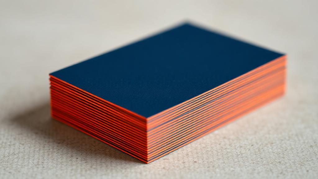
A Practical Guide to Business Card Stocks and Finishes
16pt versus 32pt, soft-touch versus spot UV, painted edges and when each one is actually worth the money.

What a Vehicle Wrap Actually Costs Per Impression
Run the math on the cheapest advertising most local businesses never buy.
Let's build something worth looking at.
Tell us about your project and we'll come back with a clear, itemized quote within one business day.