Signage Trends Shaping Main Street in 2026
Halo lighting, warm neutral palettes and dimensional layering are replacing the flat plastic cabinet. Here is what is actually worth investing in.
June 18, 2026 · 6 min read
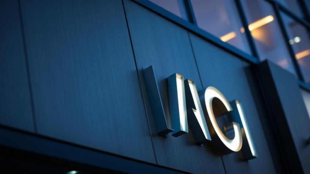
Storefront signage has quietly gone through a design shift. The illuminated plastic cabinet that defined the last three decades is being replaced by dimensional letters, halo lighting and materials that look at home on modern architecture.
Halo-lit letters read as premium because the light source is hidden. Instead of a glowing face, you get a soft outline on the wall behind the letterform. It costs slightly more than face-lit channel letters and it changes how a building is perceived after dark.
The second shift is palette. Saturated primary reds and yellows are giving way to deep navies, warm neutrals and single accent colors. Restraint reads as established, and established reads as trustworthy.
Finally, layering. Combining a brushed metal backer panel with acrylic letters and a subtle reveal gap creates depth that a flat sign cannot match — and it photographs far better, which matters when your customers are the ones distributing your images.
Related reading
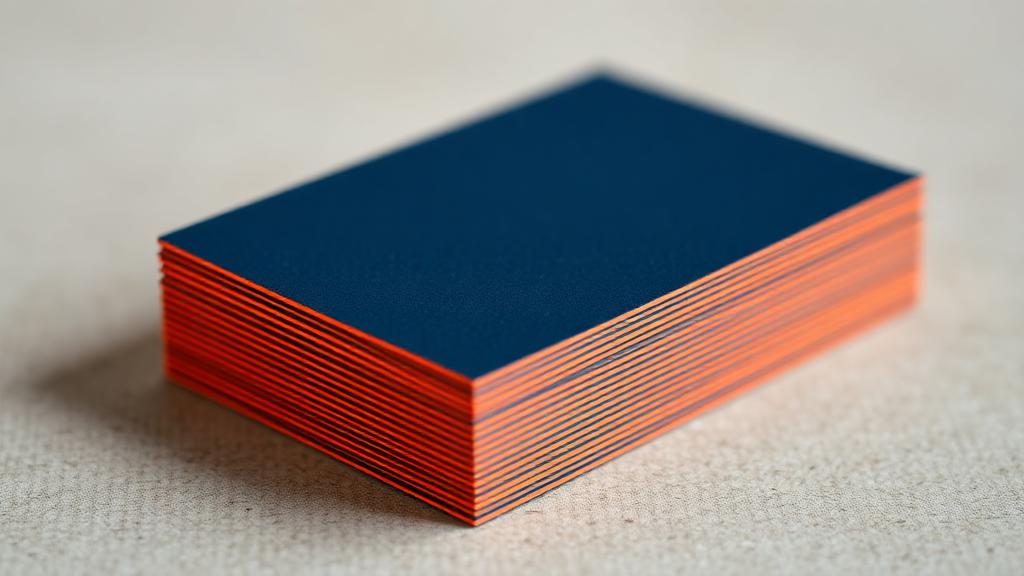
A Practical Guide to Business Card Stocks and Finishes
16pt versus 32pt, soft-touch versus spot UV, painted edges and when each one is actually worth the money.
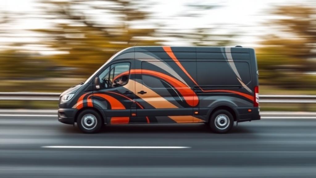
What a Vehicle Wrap Actually Costs Per Impression
Run the math on the cheapest advertising most local businesses never buy.
The Brand Consistency Checklist for Growing Businesses
Twelve touchpoints most companies let drift, and how to lock them down before you scale.
Let's build something worth looking at.
Tell us about your project and we'll come back with a clear, itemized quote within one business day.